A logo in 3 concepts: pick a direction without 10 reworks
Endless logo edits aren’t about the designer — they’re about missing criteria. How we lock the choice on three concepts and why it saves everyone’s nerves.

Founder of ELITIST
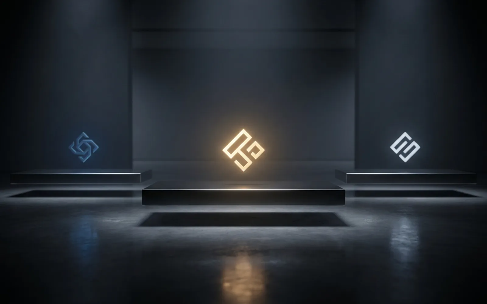
“Make a couple more options” is the most expensive phrase in design. It appears when there’s no decision criterion: the call is made on “like / don’t like,” which you can spin forever. We build the process so the choice is deliberate already at three concepts.
Why edits become endless
When a logo is judged by taste, everyone gets pulled in: a spouse, a partner, an accountant, a designer friend. Each has their own “like,” and each carries equal weight because there’s no shared ruler. The designer becomes a pair of hands shuffling options blindly, and the project drowns in edits. There’s one way out — agree in advance on the criteria by which we decide a logo is “good” at all: who it’s for, who it stands next to, what emotion it should evoke.
Three concepts isn’t three pictures
Each concept is a separate idea of how the brand should feel: strict and technological, warm and human, bold and noticeable. We show not three similar logos but three different characters. Picking one, you choose positioning, not a picture — and then we refine inside the chosen direction.
One question before you start
Before you start, answer one question — “next to which brands should my logo look like it belongs?” That reference cuts half the arguments in advance and gives the designer a clear frame of reference: it becomes obvious where the line between “bold” and “unserious” runs for your market specifically.
What you get besides a picture
A logo isn’t one file — it’s a working kit. In the end you get the mark in vector (SVG — a format that scales from business card to billboard without quality loss), versions for dark and light backgrounds, a simplified version for small sizes, and a short guide: minimum clear space, forbidden distortions, brand colors with codes. Without this kit the logo starts living its own life — every contractor stretches and recolors it their own way, and a year later the brand looks different on the sign, on social media and on the packaging.
Frequently asked questions
- Why three concepts and not five or ten? Three is the maximum a person compares deliberately. Ten options push the choice back to “like / don’t like”: the eye glazes over, criteria dissolve, and the process turns endless again. More options isn’t more choice — it’s less decision.
- What’s in a concept besides the mark itself? The idea and its logic, typography, color and — always — examples on real carriers: a business card, a sign, a social avatar, packaging. A mark can’t be judged in a vacuum; look at how it lives where your customer will meet it.
- What if none of the three lands? That’s not failure — it’s a signal the brief diverged from expectations. We go back to the criteria — who the brand is for, who it stands next to, what emotion it carries — and sharpen them. It’s fixed by one iteration of conversation, not five blind rounds of “more options.”
Checklist before ordering a logo
- State who the brand is for and what emotion it should evoke — in one sentence.
- Name the brands your logo should look native next to.
- Gather 5–7 examples and anti-examples, noting exactly why.
- Decide who makes the final call — one person, not a team vote.
- List the carriers the logo will live on: signage, packaging, an app — it shapes the mark.
Lifehack: gather 5–7 logos — both the ones you like and the ones that repel you. Anti-examples save as much time as examples: they show the designer the boundaries you definitely shouldn’t cross.
Got a project, not just a read?
Tell us about it — we'll put together a solution for your business.